User interface
The user interface of the app is automatically adjusted to screen size and application area. The overall concept is to keep the interface as simple as possible and only add more views and items for complex tasks and when a large screen is selected. The user interface is based on the Material Design concept.
Single frame
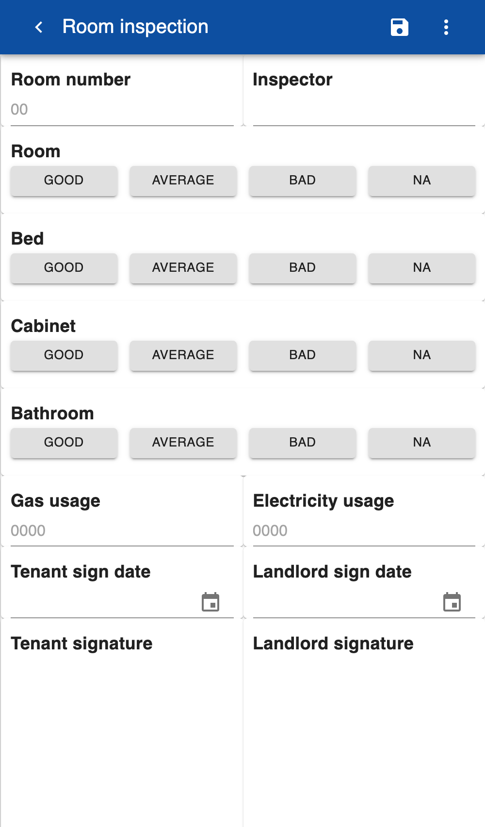
This is the default user interface when running on small screens such as smartphones. When the user clicks on an item in the list, the list display is replaced by the item. When clicking on the < icon in the navigation bar the item is closed and the list is displayed again. This view is also displayed if you a running on a web browser on a desktop computer or laptop and reduce the size of the browser.
Dual frame
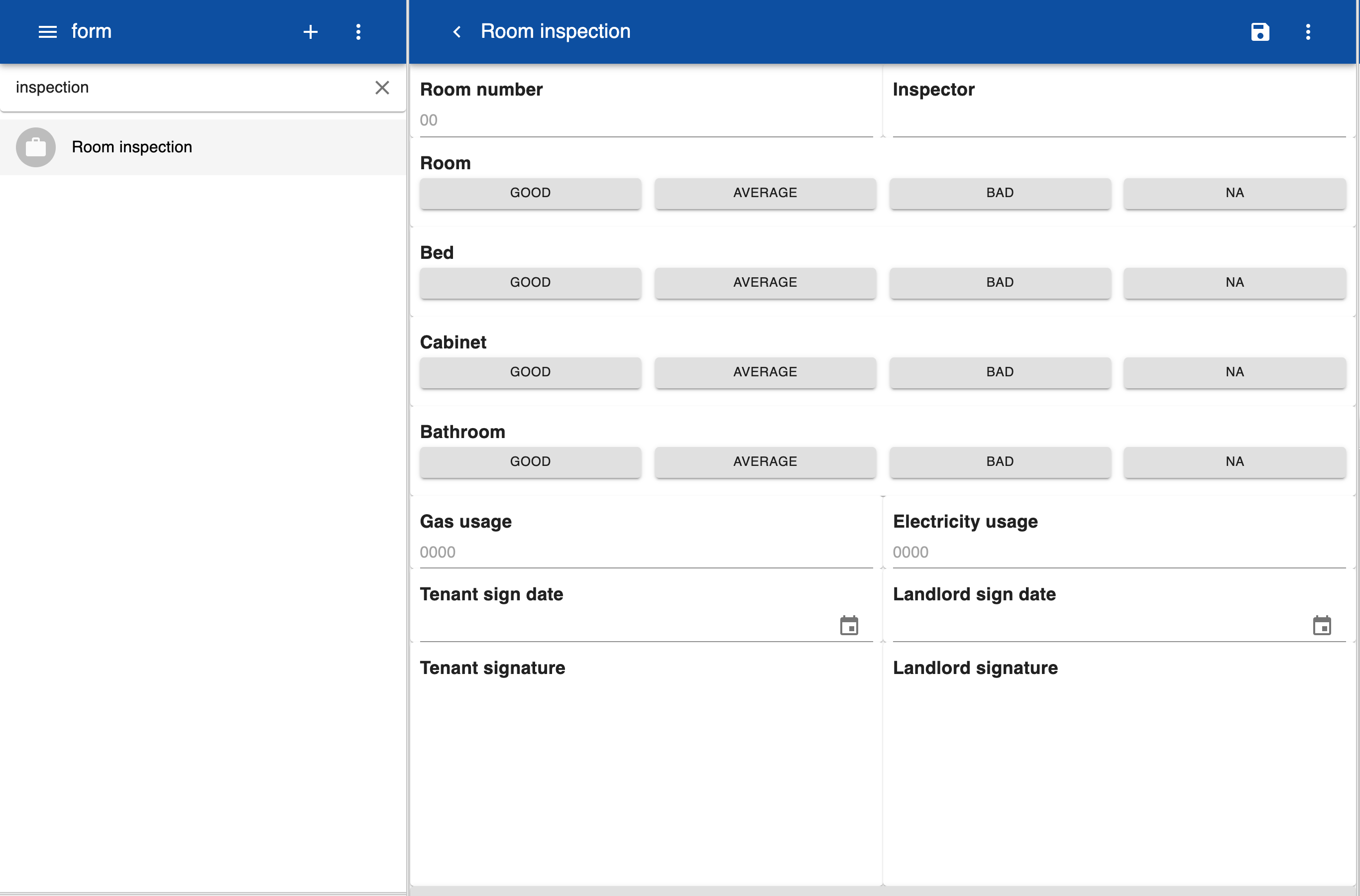
This layout is the default when working in a web browser of iPad in landscape orientation. On the top left is a hamburger icon that displays a menu when clicked. You can search for items via a search box and the results are displayed in a list. When clicking on an item the details are displayed in the right frame. Both the left and right frame have an icon on the top right with a dropdown menu. The menu options in the left frame apply to all items in the list, for example Add or Delete. The menu options in the right frame apply to the current item, such as Save or Delete. The most frequently used menu item is also displayed as an icon. If you move the mouse over the item the name of the corresponding menu item is shown as a tooltip.
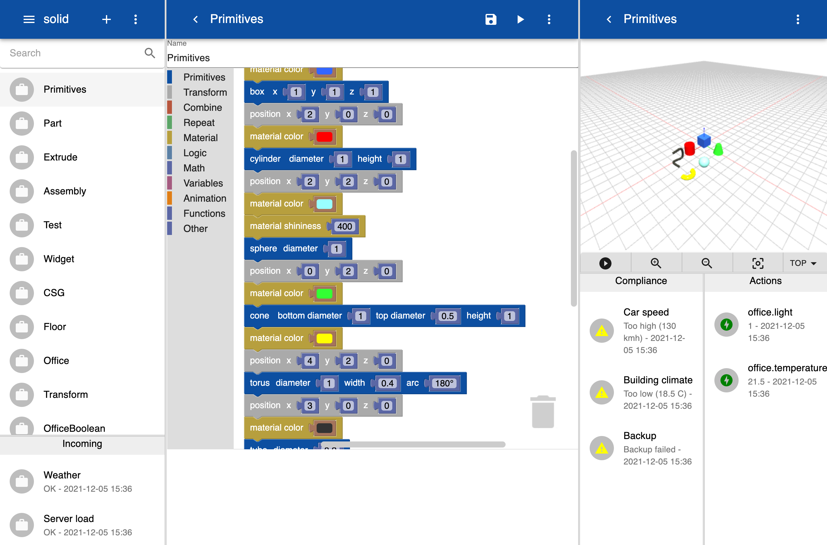
Multi frame column
This view has multiple panels with list views, details and graphics. It is automatically selected when working with 3D models. You can change the size of the panels horizontally and vertically by dragging the dividers. The selected layout is maintained for future sessions even after the browser has been closed.